A redesign of the first version
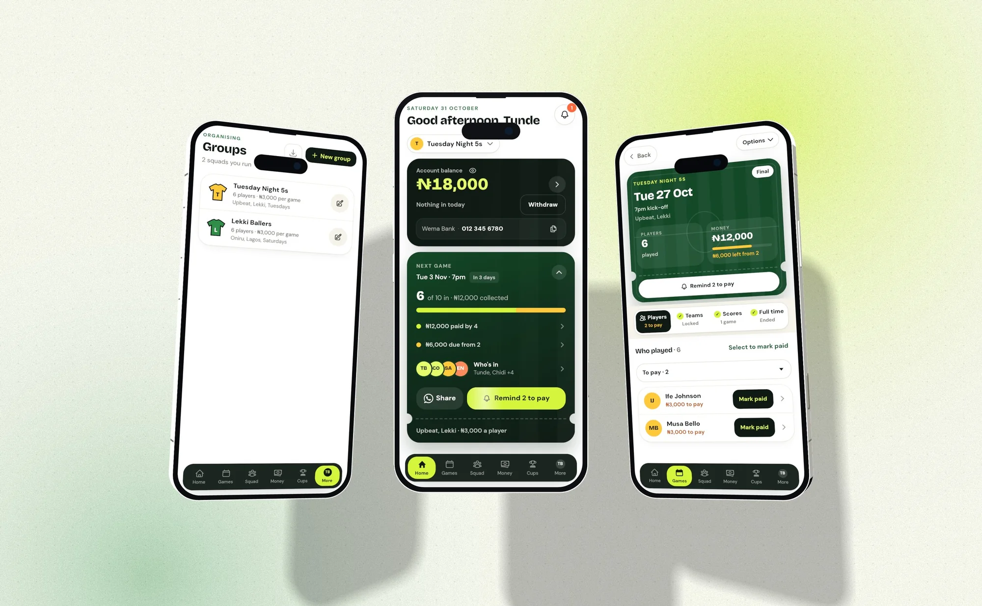
I redesigned PitchAside's initial v1 across the organiser app and player joining experience, and worked on its website. The product helps five-a-side football groups in Nigeria arrange games and collect the money needed to pay for the pitch.
The starting version was missing key features. Worse, it did not keep money front and centre, and secondary features felt primary. I ran user testing with one of their five-a-side organisers and users, and that shaped the problem statement.
Knowing who is playing is only part of the job
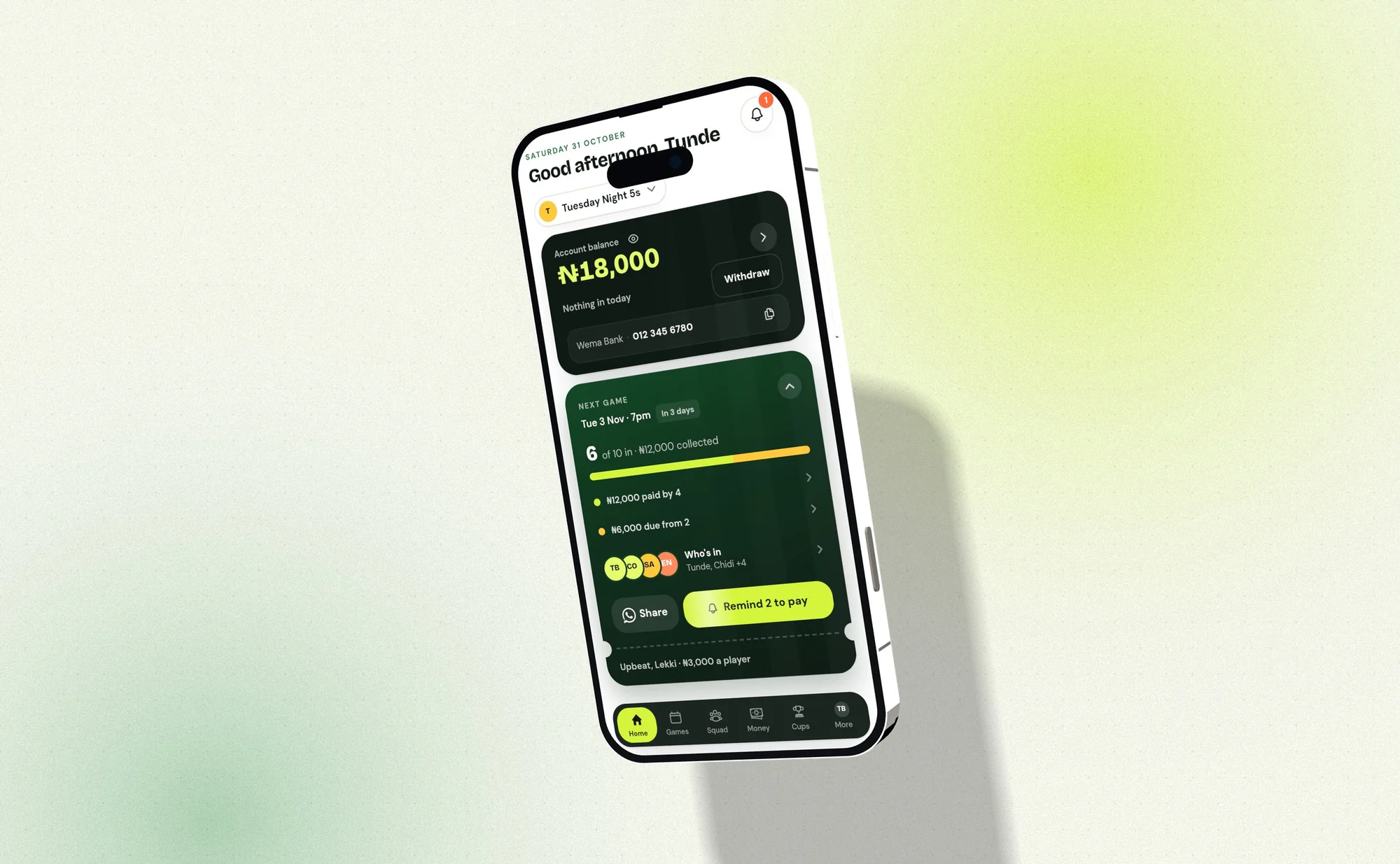
An organiser needs to know who has paid and whether there is enough money for the game. A player list cannot answer that alone. Money can arrive without an obvious name, and a player can pay ahead, so attendance and a bank balance can tell different stories.
Testing led me to frame the redesign around that responsibility. If an organiser has to hunt past secondary features to find contributions, the interface is making their main job harder. The money and the next game had to lead.
Follow an organiser through collecting for a game
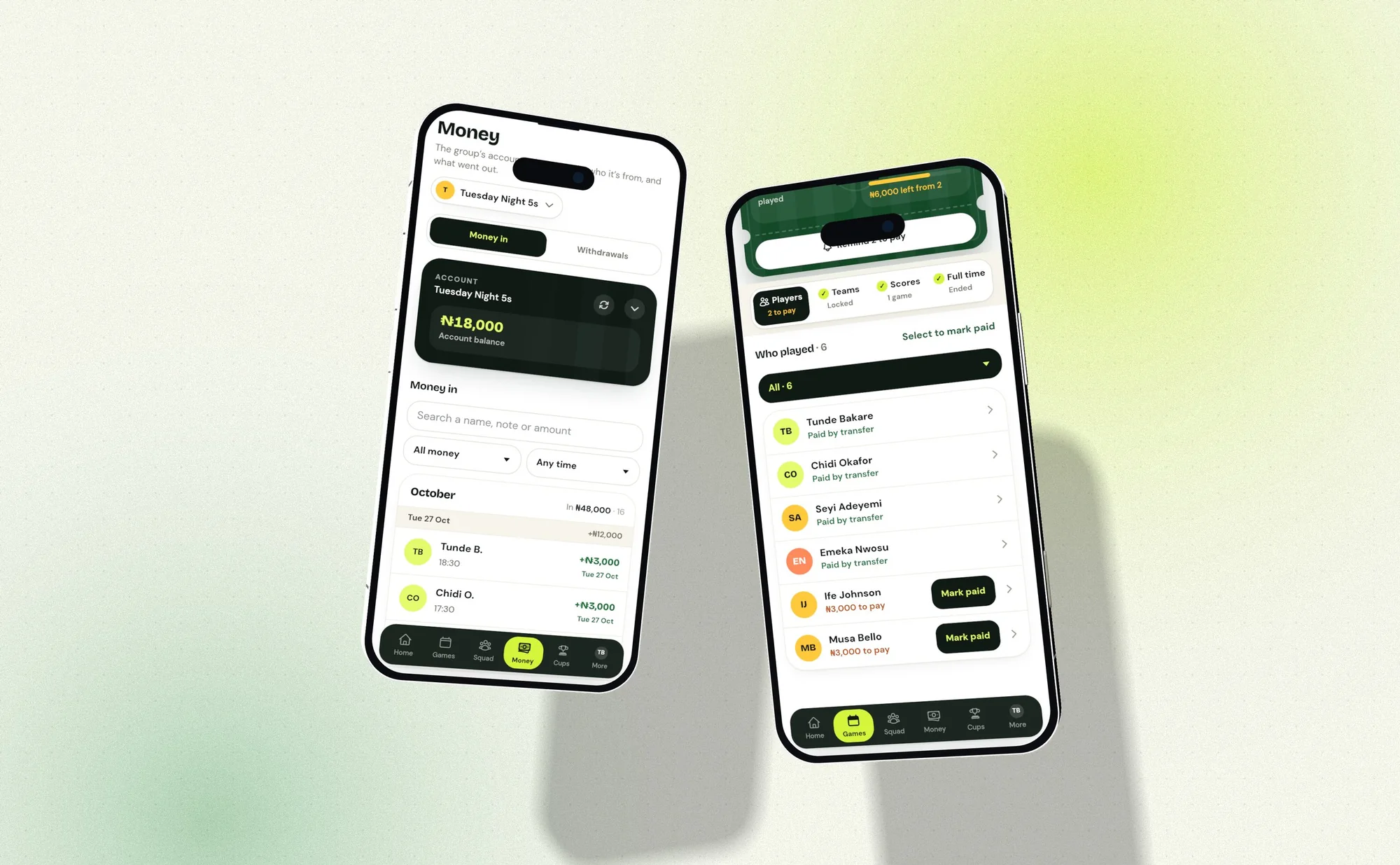
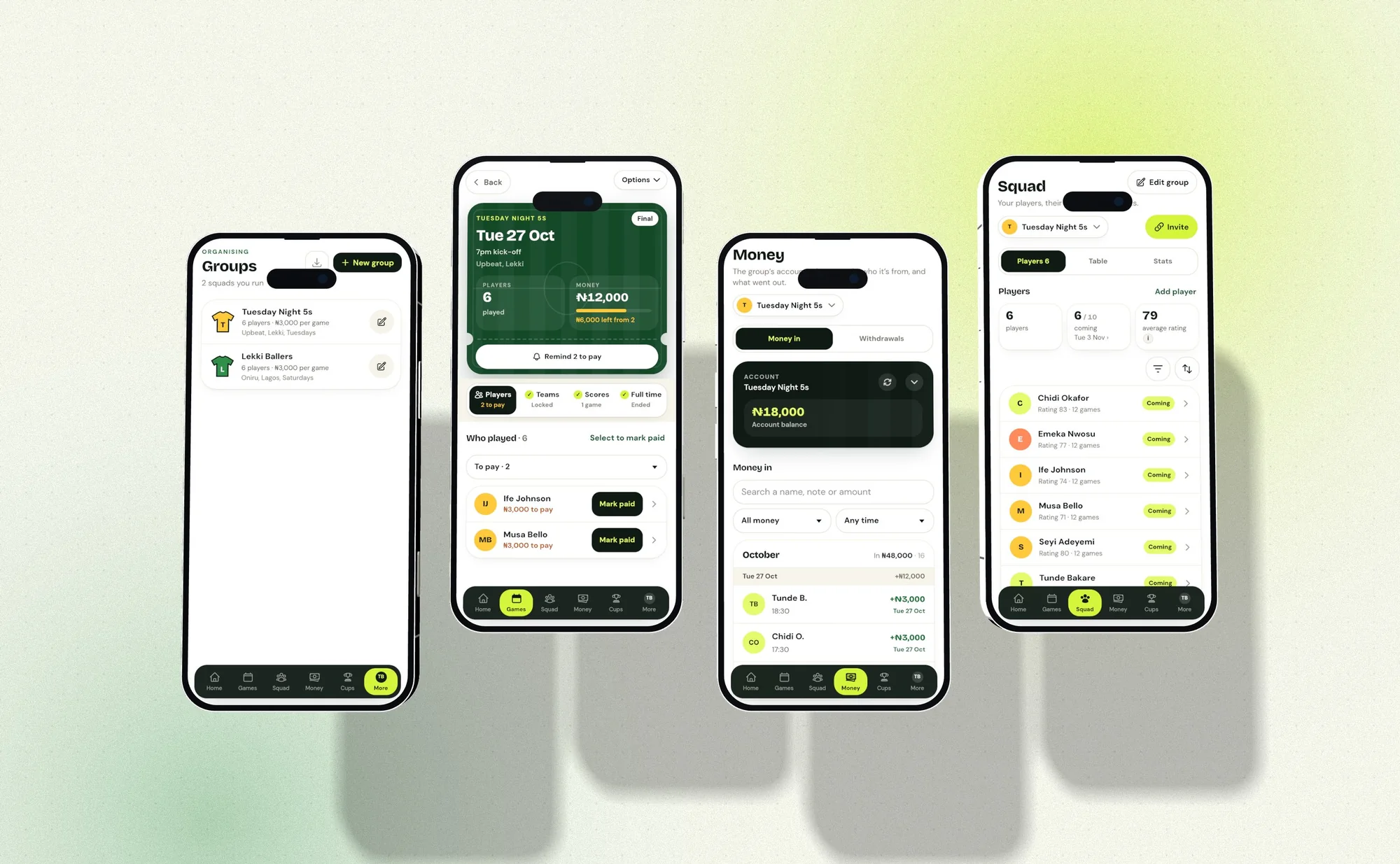
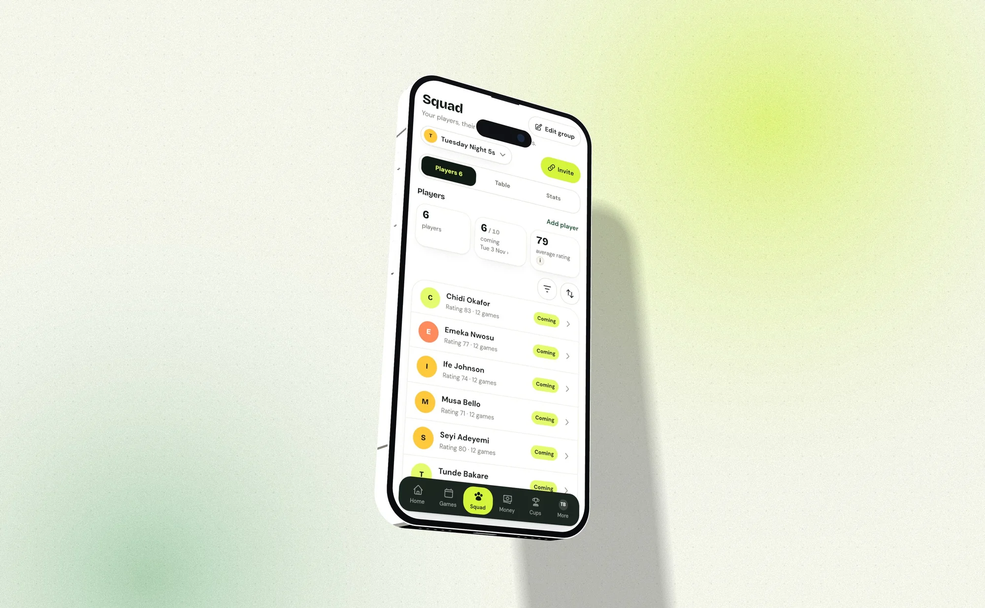
I organised the home screen around the account and the upcoming game. From there the organiser moves into the player list and sees contributions. Scheduling and inviting players sit around that task and do not compete with it.
I also followed the player's side of the payment. Joining a group does not always mean money is owed straight away. A payment prompt has to say which game or unpaid amount it covers, especially when the player already has credit.
A transfer is not the same as a manual mark
Matching a bank transfer automatically saves work, but a similar name does not confirm who paid. Uncertain transfers have to be left for the organiser to resolve. A manually marked payment also has to stay distinct from money the bank has received.
The balance is tricky too. Advance payments and unidentified money sit inside it, so the total is not all free to spend. The language around contributions had to match what the payment system actually knows.
Make payment progress visible where decisions happen
I kept collected and outstanding contributions next to the player list. Each group has a bank account, and incoming transfers are matched where the system has enough information. Manual updates stay available, and uncertain names appear as suggestions, never automatic confirmations.
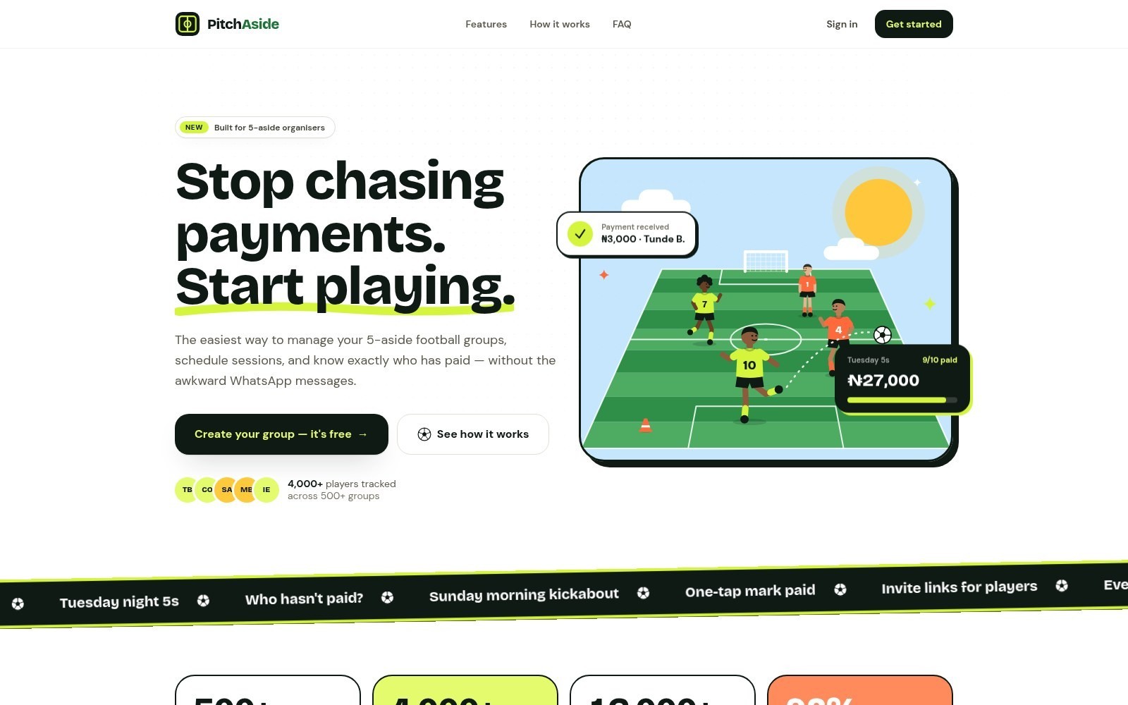
The player flow explains what a transfer pays for, and the group context stays visible between screens. WhatsApp sharing fits the way groups already coordinate. The redesigned website introduces these everyday organiser tasks.
The layout has to agree with the money
The redesign took me back to the organiser's real job. An app can offer plenty of features, but someone still has to collect enough for the game. Testing the first version showed me that task deserved the most attention.
I also learned to treat payment language as part of the product's logic. Calling someone paid has consequences, so the screen has to show whether money arrived, was marked by hand or still needs matching.
Based on my original PitchAside case study ↗ and the product website ↗. Reviewed November 2026. Screens show the version documented in this case study.